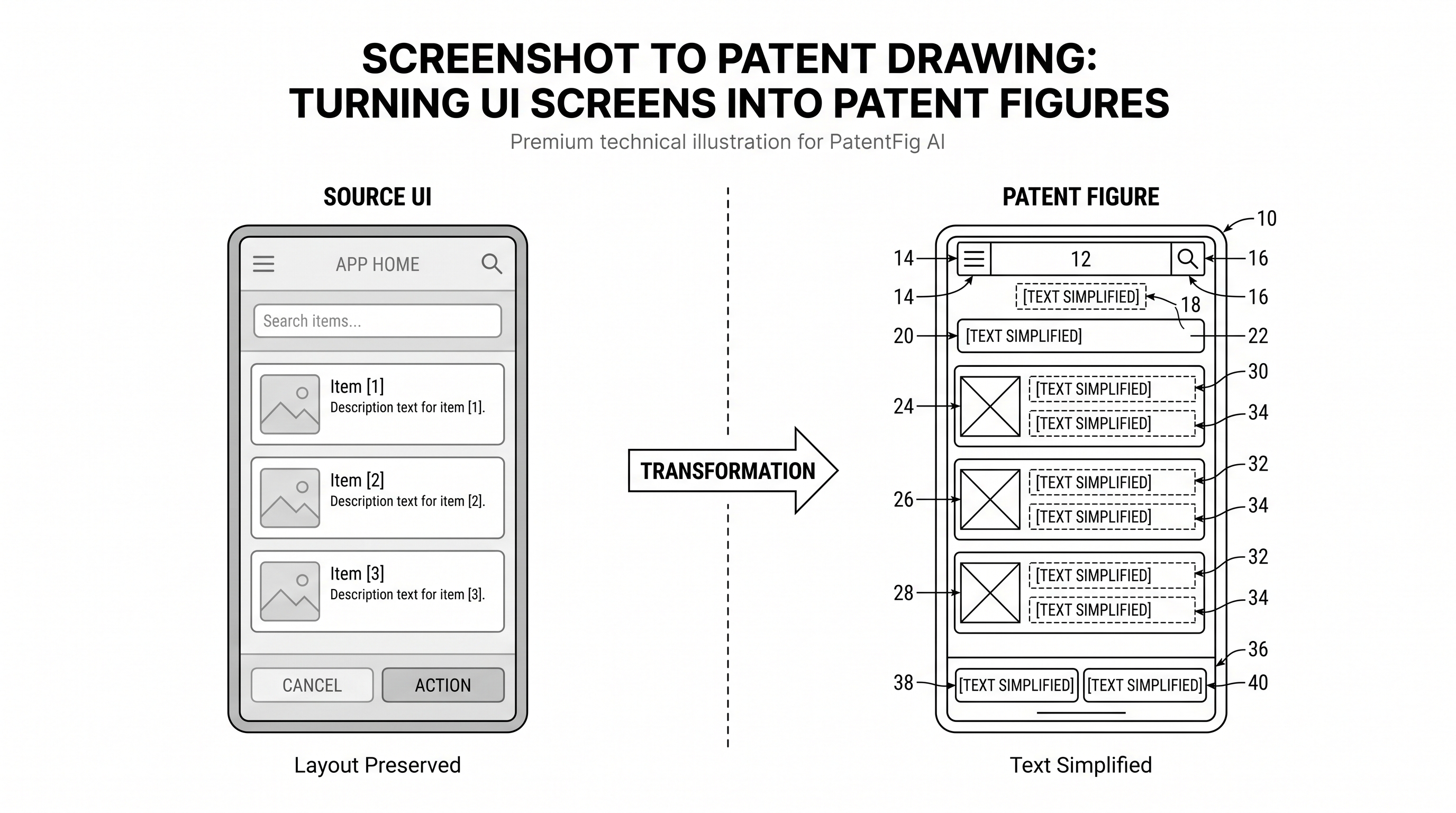
Screenshot to Patent Drawing: Turning UI Screens into Patent Figures
Learn how to convert UI screenshots into patent-style figures with simplified text, preserved layout, reference numerals, and clean black-and-white line art.
TL;DR: Don't trace the screenshot — rebuild it as a technical diagram: keep the interface regions and workflow that support the claim, strip real text, user data, color, icons, and branding, then add short labels and stable reference numerals. Pair the screen figure with a flowchart whenever the invention is the sequence rather than the layout.
Software teams often have the right evidence in the wrong visual form. The product manager sends a screenshot. The UI shows the workflow clearly. But it also contains color, shadows, real text, user data, icons, brand treatment, and layout details that make sense in a product demo rather than in a patent figure.
Need to turn UI screens into patent-style figures? Try PatentFig AI in the generator.
The job is not to “trace the screenshot.” The job is to preserve the interface structure that supports the invention while removing details that distract from it. A patent-ready UI figure should read like a technical diagram: clear regions, short labels, stable reference numerals, and simple line work.
This is especially important for software, AI, workflow, marketplace, dashboard, mobile app, and control-panel inventions where the user interface is one way to explain the system. The USPTO notes that drawings should show the claimed subject matter when needed for understanding, and drawing standards are addressed in MPEP 608.02 and 37 CFR 1.84. If the figure may be reused internationally, PCT Rule 11 is also useful because it discourages unnecessary text in drawings and emphasizes reproducibility.
What A UI Patent Figure Should Keep
A screenshot has too much information. A patent figure needs the right information.
Keep:
- Screen boundary and viewport shape.
- Main layout hierarchy.
- Functional regions such as navigation, input, content, results, control, status, and preview.
- Relationships between panels, modules, and user actions.
- Short labels when needed to understand the function.
- Reference numerals and leader lines.
Remove or simplify:
- Color, gradients, shadows, blur, drop shadows, and texture.
- Brand marks, product names, account names, and user data.
- Dense text, long sentences, table data, and marketing copy.
- Decorative icons that do not support the invention.
- Exact pixels that are not legally or technically important.
The result should preserve structure, not personality.
Before And After: From Product UI To Patent Figure
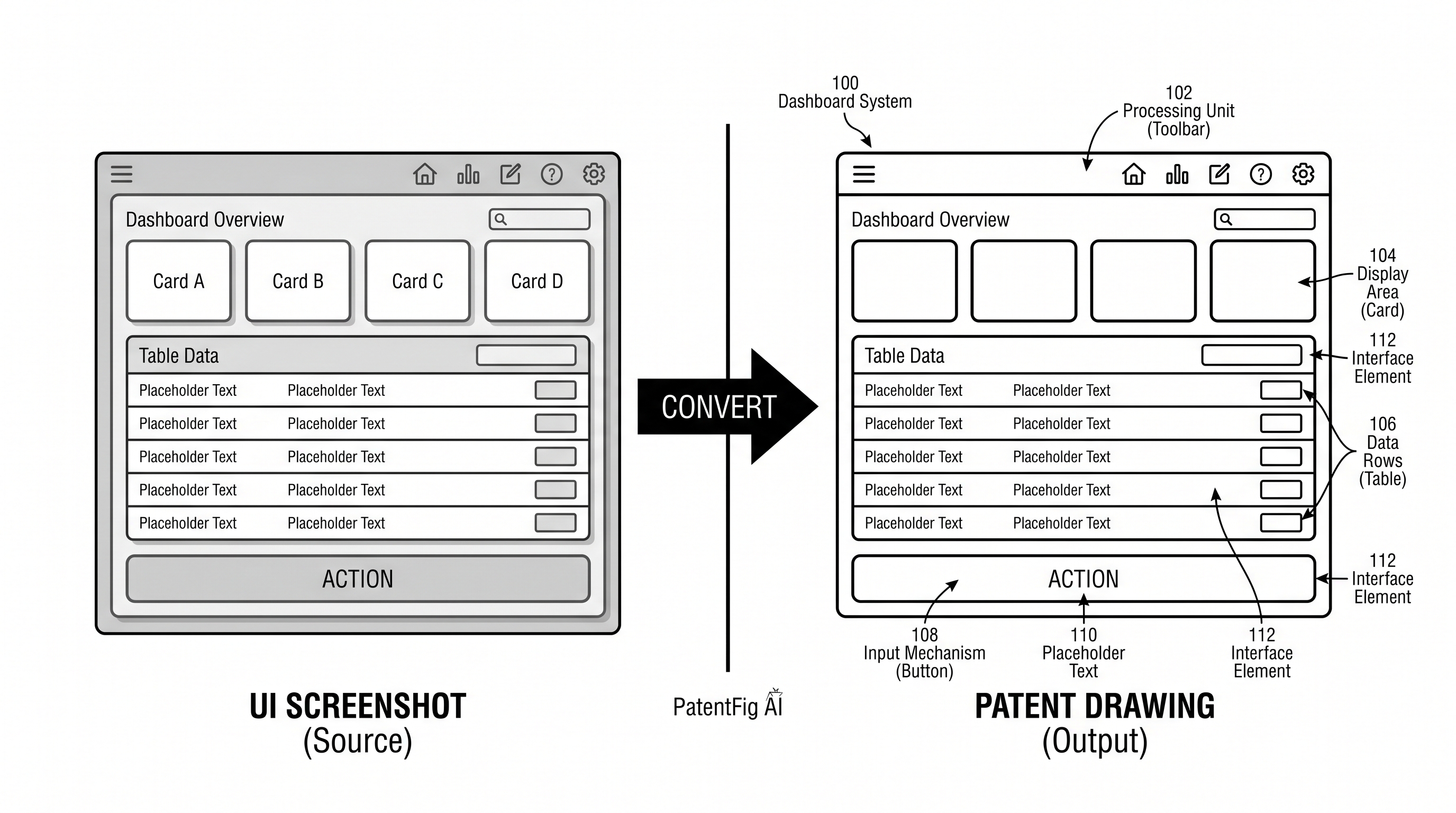
A good UI conversion has three passes.
First, convert the screenshot into a simplified wireframe. Keep the screen, side navigation, header, card structure, list rows, buttons, and input areas. Do not keep the real visual design.
Second, convert the wireframe into patent line art. Use uniform strokes, black-and-white boundaries, sparse labels, and clear spacing. A button does not need to look like the production button. It only needs to identify an action control.
Third, add reference numerals. Number the screen as a whole, then number functional areas. This is usually better than numbering every small UI element.
For example:
| UI region | Possible reference numeral |
|---|---|
| Display screen | 100 |
| Navigation area | 110 |
| Content panel | 120 |
| Input field | 130 |
| Action control | 140 |
| Status indicator | 150 |
| Recommendation module | 160 |
| Result list | 170 |
Common Mistakes In UI Patent Drawings
The most common mistake is over-preservation. Teams want the figure to look exactly like the product screenshot, but patent drawings rarely benefit from that.
Watch for these problems:
- Too much text. Replace paragraphs with short placeholders such as “Input,” “Result,” “Status,” or “Recommendation.”
- Product branding. Remove logos and customer-facing brand elements unless counsel has a specific reason to keep them.
- Decorative UI styling. Shadows, gradients, rounded cards, and color states usually distract from the structural interface.
- No reference numerals. A clean wireframe is not enough if the specification discusses regions and modules.
- Pixel-perfect obsession. Patent figures need functional clarity more than exact product fidelity.
- Unclear flow. If the invention depends on a sequence, add arrows or a separate method flowchart.
The strongest UI figure is often less detailed than the screenshot but more legally useful.
Reference Numerals For UI Screens
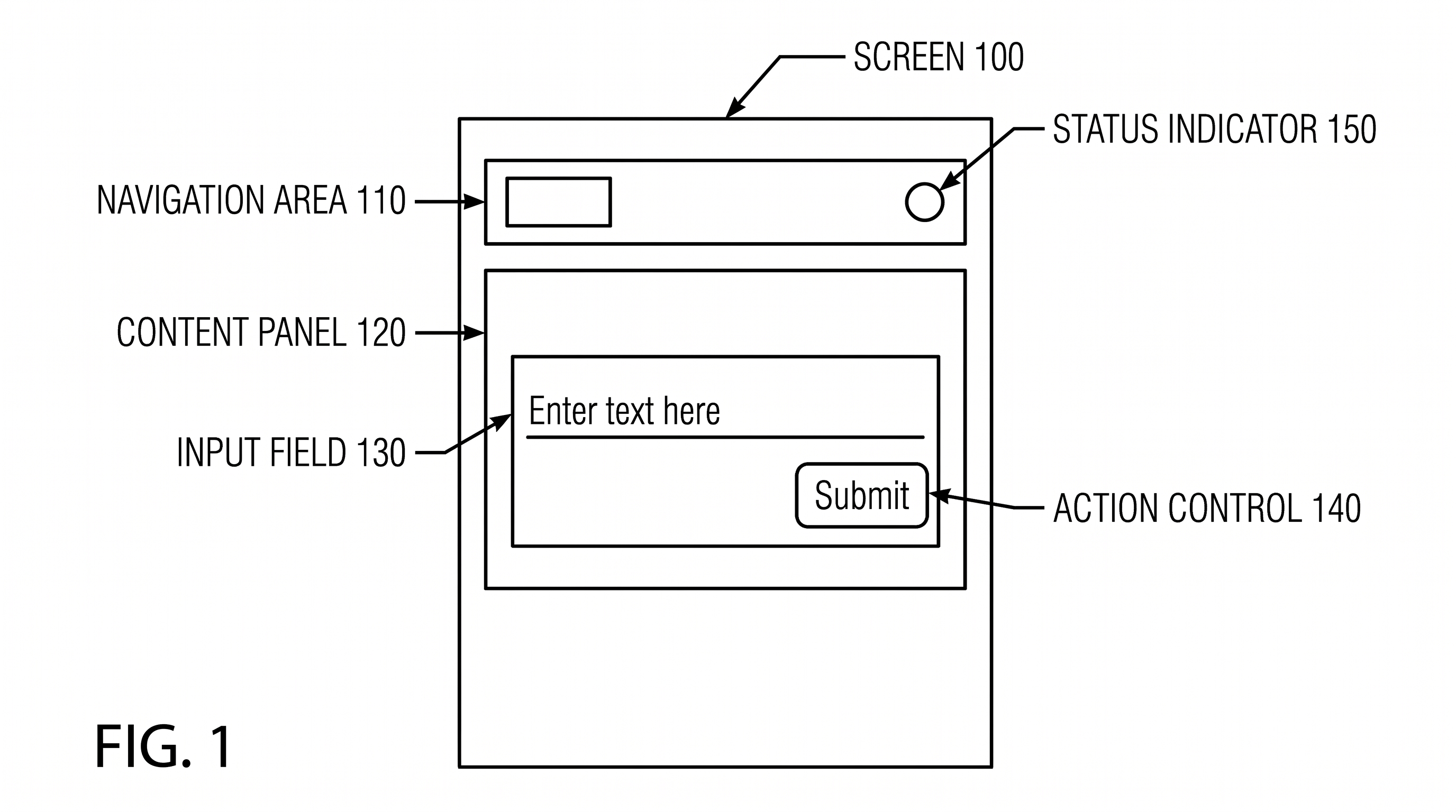
Do not number every pixel. Number the concepts that matter.
A useful numbering model:
- 100 for the display screen or interface.
- 110 series for navigation and selection regions.
- 120 series for content panels or cards.
- 130 series for input fields and input controls.
- 140 series for action controls.
- 150 series for status indicators, warnings, or confirmations.
- 160 series for generated results, recommendations, or predictions.
- 170 series for user history, logs, or data tables.
Keep the same logic across figures. If the recommendation panel is 160 in FIG. 3, do not call a similar recommendation panel 240 in FIG. 4 unless there is a reason.
Prompt Template For Screenshot Conversion
Use a prompt that gives the model both preservation and deletion rules:
Convert this UI screenshot into a black-and-white patent drawing focused on interface structure. Preserve the layout hierarchy, screen boundary, navigation area, content panels, input fields, action controls, and status region. Remove color, gradients, shadows, icons that are decorative, product logos, user data, and dense text. Replace long text with short functional placeholders. Add reference numerals and straight leader lines for the major interface regions. Do not change the relative positions of the primary UI components.For follow-up edits:
Keep the current UI layout unchanged. Add reference numeral 140 to the primary action control and numeral 150 to the status indicator. Simplify the text inside the content cards to short placeholders. Do not add new UI panels.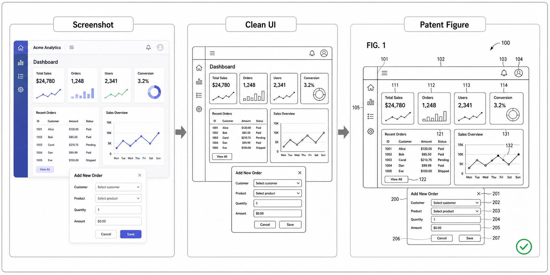
The phrase “keep the current layout unchanged” is important. It prevents a revision from turning into a full redesign.
When To Add A Flowchart
Sometimes the UI screen is not enough. If the invention is a workflow, the figure set should include both a screen figure and a method flowchart.
Use a UI screen figure for:
- Where the user acts.
- What information is visible.
- Which control triggers the operation.
- How modules appear on the display.
Use a flowchart for:
- Server-side processing.
- Decision branches.
- Model inference.
- Validation, queueing, ranking, or synchronization.
- Steps that happen after the user clicks.
For software patent drafting, this split is useful: the UI figure explains the human interaction surface, while the flowchart explains the method.
A Practical Workflow
- Capture the screenshot or mockup.
- Remove confidential data before using it as a reference.
- Identify the interface regions that map to the specification.
- Generate the simplified patent-style line drawing.
- Add numerals and leader lines.
- Create a separate flowchart if the claim depends on process steps.
- Review against the specification before export.
PatentFig AI can help with steps 4 and 5, but the patent team should own steps 2, 3, and 7.
Create UI Patent Figures Faster
Ready to turn app screens, dashboards, mobile UI, or SaaS workflows into clean patent figures? Open the PatentFig AI generator.
Next step: Open the generator and try this workflow with your own source material — or browse patent drawing examples for a starting point.
Author

Categories
More Posts
Software Patent Diagrams: Architecture, Flowcharts, UI Screens, and AI Systems
Plan software patent figure sets across architecture diagrams, method flowcharts, UI figures, AI pipelines, and export review.
Patent Block Diagram Examples for Software, Hardware, and AI Systems
How to structure patent block diagrams for software systems, hardware products, AI workflows, networked devices, and platform inventions.
How to Turn Software Architecture Into Patent Flowcharts
Turn software architecture into USPTO-compliant patent flowcharts with AI. Method steps, system diagrams, and Section 112 safeguards in one workflow.
Newsletter
Join the community
Subscribe to our newsletter for the latest news and updates